Death Of An Icon: TheMacOSXDock comment
Not adapted for MacOS X Public Beta or the final, shipping version, though the issues, unfortunately, remain the same.
The Dock is the amorphous collection of pictures of documents, programs, functions and volumes at the bottom of the Aqua look Finder for MacOS X. What are these little pictures, what do they do, what is their commonality- why are they all lumped together, can anything be put there at the users whims? What are these little pictures all about?
The Dock.
For more Mac critique, have a look at www.AppleBlunders.com
Death Of An IconYes, they are pictures now, not icons. They are much too detailed and contain too much extraneous information to be icons. According to Websters Online Dictionary, the etymology of icon is: "Latin, from Greek eikOn, from eikenai to resemble". Meaning... "5 a : a sign (as a word or graphic symbol) whose form suggests its meaning. b : a graphic symbol on a computer display screen that suggests the purpose of an available function" It seems Apple has forgotten about this basic concept: The word comes from the Greek to resemble and has come to mean a symbol which suggests a purpose. It is not a photographic representation of something which exists. This is an important distinction.
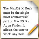
What is the difference between the word 'cat' and a picture of a cat? The word refers to cats in general, the archetypical, general furry pet, but a picture shows you a specific cat. A cat with a specific hair color, fur color, degree of fuzziness etc. In interface design this means that the more information an icon has, the less iconic it becomes and the more it looks like something specific, it goes from 'cat' to grandmothers' cat 'Sweet' (Yes, a real cat has been refereed to as 'Sweet'). Look at the Dock above, from left to right: There is a document (or an application, I'm not 100%), a QuickTime Player program or a QuickTime movie (of whatever I have no idea), an email or an email application, some kind of hardware I think, the Apple Web site?... And a trash can.
So these little pictures, much larger than the previous MacOS icons, can be expected to reveal more about what they represent- adding detail does not necessarily make remove the 'icon-ness' of the icon. But the Mac OS X icons don't add information. They add graphical flourishes. They have no name, no preview information of what the documents contain and it seems like a mish mash of documents, applications, hardware and even functions (trash, indicating file deletion). Wow, this is really bad.
To 3D Or Not To 3D?The real world. It's 3 dimensional, but for some funny reason we prefer to read our documents and look at our pictures head on, or at least only slightly twisted away from us. Still, the rage in interface design is 3D everywhere. There are some benefits from working in a 3D environment, it is in some ways more natural for us and can help us orient better and by adding that third dimension, we have a bit more room. But there is a difference between a 3D environment and a 3D item. Stacking lots of documents partially behind each other in 3D and allowing for different view is an exciting possibility though it could easily get messy. A specific item, just like in real life, is better to see face on. Now that Apple has decried that bigger is better, they should at least use some of that size to show what is so special about this document which the user has been given a 'picture' of. For God's sake how useful is the picture below left? Flatten it out, add a couple of words from the beginning of the document now that the space is there and wham- The document is this article! It's as easy to recognize as if it were lying printed on my desk. No longer anonymous. No longer an abstract pointer to data held somewhere else, but in the users eyes, a document right there in front of them, just like they are used to on their real desk , they get an immediate feeling of what the document is.
As a footnote is is worth pointing out that on the computer screen everything is obviously as much 2D as it is 3D. What I refer to here then is the comparison between an object rotated in simulated 3D space to emphasize the 3D space or oriented toward the viewer getting closer to what we think of as 2D.
A MacOS X Document in 3D. The Same Document in 2D.
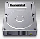
A Document Is Not A Piece Of Hardware & Vice Versa. And An Application Is Something Else Entirely.How many new computer users have actually seen a hard drive? Why is Apple, in their dumbing down of the interface, I mean, in their effort to make it user friendly, using a photograph of an internal piece of equipment to indicate that this is where the user stores his or her documents and everything else? Imagine walking into some ones office and seeing a desk on which there are documents, magazines and a huge metal filing cabinet! Or even worse, in some surreal nightmare, the office you're in on the desk. This is what happens when containers can be depicted outside their logical hierarchy. In other words, a Hard Disk shown right next to the document it contains, seemingly on the same hierarchical level. Consider that the computer is a virtual environment of which the internals can always be seen in a myriad of ways, it is important to present a context, a sense of place. Information stored on a computer can never be seen directly. It always has to be represented somehow. Not to get too philosophical or technical, just look at a web page on Mac and Windows. Different size type, difference darkness for whatever pictures are on it. The page is being represented to you. So when it comes to the top level storage volume, don't put the damn container in the same level of the visual hierarchy as the folders, applications and documents it contains. Please. This is just silly. Same goes for secondary drives and remote volumes, CD's and Zip drives. Having them on the top right hand corner of the screen, as the Mac has had since day one is a great solution. Maybe not the ultimate solution, but it is a great solution. How long did it take Microsoft to copy this? And they couldn't even make the volumes live. There is a shiny CD on their desktop whether there is a CD in the CD drive or not. And then they have the famous 'My Computer' icon which even has the network inside it. Apple, keep the gems. Put the hard drive back. Keep it in the top right hand corner. Also, while you're at it, why not make it give the user a bit of information. What is a user interested in first when looking at a volume? That it is the right kind. Ie. Hard drive vs CD or Zip. So let's show an icon looking like a Hard Drive box or a CD or a Zip disk. Second, the user would like to know if it's the right specific volume, hence the name under the icon. Then, if that is not enough, it could be useful to know large the volume is and how much space is free. Have a look at the volume on the right, just below. It's a hard disk. It looks like a box. A volume. It lives in the top right hand corner of the screen. It is called Allah, has a maximum capacity of 4GB and is filled up as much as the (for the sake of this demonstration) blue line rises up. A small attempt at trying to provide more transparency, by building interfaces which actively display more than they reveal, without being cluttered.
A MacOS X hard drive. I think. Could be any kind of hardware. Has a novice user even seen one of these? Notice how they think the monitor is the computer? This is not useful.
A more liquid hard drive filling up and emptying. Why look at the 'innards of the machine?
The same kind of gradual disclose of different levels of information as shown above when looking at a hard drive also applies to all other icons/pictures. Can you tell me what this is? A program? A documents? What does it contain? It's actually an email application.Having put the volumes in their rightful place, how do we differentiate applications, as we geeks call them, or programs as the rest of the universe refers to them? You know, I can't point to any high falutin' research or principles for how to make an icon look programish, so I just made it large, gave it a severe drop shadow and appended to prefix to the name: 'Program'. Sorry. I know it's obvious, but when you're a newbie, this helps. Same can be done for Hard Drives and anything else which isn't a simple document. If you're a pro, you know how to delete this extra bit of text. Hey, you should be able to delete all the text under an icon - if you want to, through an easily accessible preference. Variable level interfaces are nothing new, but it's an important and currently mostly ignored concept which is outside of the scope of this article.
A Program, labeled as such. For novices.
Twice the Information, Twice The Meaning.Nothing is obvious on a computer screen. Nothing is automatically communicated. The computer screen is not a window onto cyberspace, it is a projector showing only what the interface allows to be seen, to rehash the extremely important point made further up. Them icons need to speak their minds. What is the most important information a user wants to get when looking at a document icon? What kind of document it is: Is it text, picture or video etc. Secondly it is interesting to know what document it is in specific: What text does it contain, what picture is it etc. Look at this sorry 'icon' again below. According to the designer of this picture the most important information needed to be conveyed is a pencil, prominently displayed in the foreground (how does a pencil even make any sense? Was this hand written and scanned in?), then the page (a computer having no such thing, they only come into being when a document is printed of course) and the fact that there is some sort of text on the (single?) page. The key is to communicate consistently, clearly and simultaneously both what kind of document the icon represents and specifically what that document contains. Communicating both the generic/media type (is the document text, video, 3D etc) and specific (preview image/text). In this MacOS X picture you can only see the generic. This is a text file:
That MacOS X Document again, showing only generic information. However, combining both generic and specific information can be done by simple adding a frame around the preview:
Here is an example of a still image icon.
You can see it's a still image by its picture frame border.
Here is an example of a video icon.
You can see it's a video document by the sprockets.
If you are concerned with more information,
such as what program created the document,
it's a simple matter to add small badges with the programs iconAnd back to the Aqua Dock way of showing documents. A meaning-starved, large picture.
It seems the picture here has some sort of a frame,
but what happened to the preview in the center? Is this
just a picture for a QuickTime Player Program?
Mouse-over information can be very useful to give yet another level of information when the user points to a program or document. For animation that can be size (height and width) and length as shown here whereas for stills it can be dpi and size (height and width) . This video image also shows a 3 frame preview loop. Obviously this can be too much and therefore needs to be a user cancelable option. MacOS X does this on the document but only to show the documents name. Ouch.
Pointing for more information.Relative size is an opportunity completely lost in the MacOS X Dock where every document is the same size, so I won't go into that here except for showing a couple of simple relative sizes:
DIFFERENT MEDIA TYPES NEED DIFFERENT KINDS OF SIZE VISUALIZATION.By that I mean that still images get bigger in two dimensions as above, and text as page upon page ie; multiple pages stacked one behind another as is illustrated here.
The first icon represents a text document of less than 3 pages (less than 1 or up to 2 pages, printed both sides of the paper), the second represents less than 20 pages (should be a user preference somewhere, the thinking is that this is about as much as paper clip will hold) and finally, anything bigger, which will need to be bound. Yes, that is supposed to be a bound/book icons :)
Expect Only a Few Bookmarks And A Couple Of Documents?Remember the original Macintosh? A thing of beauty. I'd go so far as to say it was the most elegant version of the Mac ever. Everything has just gotten more complicated since then, which is fine and expected. The thing is, the original Mac and the original Macintosh Operating System was phenomenally elegant if you only had a couple of documents. Once you worked for a while things quickly got out of hand. And this is what seems to be happening again. Look at the picture below left. Let's decode it. It has a huge, beautiful iMac and the word 'Apple' in the Apple corporate typeface and I think I can faintly see the outline of a browser window. It must be the Apple Web site! So why not just have a tiny little thing with basically the name and a simplified URL:
The large, un-informative Bookmark. I have over a hundred frequently used Bookmarks. How many do you have? OK, it is really nice to see the bookmark in the Dock if it is Live, but how many can you realistically accommodate in a list.
Same Information, easier to read and smaller so you can have many more. How to deal with large numbers of other documents is another story entirely and there is a lot of promising research and products abuzz in this field. Just seems like Apple has chosen to (temporarily) ignore it.
Too Many Items And No Order.How organized do you think you'd be if you put a hundred documents and other stuff like CDs, boxes and a dustbin in one large pile on your desk? Probably not a whole lot, though it might make you feel like you're back in college. So you organize things and expect certain things to be in certain places not all in one big lump. Then why does Apple think this would be such a great thing on the computer screen, lumping tons of little pictures together all on the bottom of the screen like that? The computer screen has four sides and four corners. In Mac OS 1 through 9 those corners meant something. The hard drive is the icon top right side of the screen. The menu at the extreme top right give you access to running programs. Preferences and utilities are accessible from the menu at the extreme top left. The trash is at the lower right. The program menu is at the very top. Imagine driving a car and all the controls are lumped together in one big pile. No central steering wheel or brakes for your feet. This wouldn't make for a very efficient driving experience but thinking about it does point out how important 'muscle memory' is for us in our daily lives. We 'just know' where things are after a while and we interact with them more efficiently because of this. There's no hunt and peck. No running your cursor over a jumble of pictures to get a name and a larger view so you can see which one is the one you are looking for. Please Apple, give meaning to the different parts of the screen and that make it easier to find different kinds of functions in specific places. I know you can do it.
Conclusion. Of Sorts. Just think of the names here: They call Aqua the liquid interface. And this is where is ceases to be liquid, at the Dock. Makes poetic sense somehow. As far as the rest of Aqua is concerned there are many more issues to be explored, will executives want a candy colored interface? I mean, sure, the Mac is a consumer machine now, but I hope Apple won't forget that they have a strong design market. And if it truly were a consumer brand only as Steve Jobs seems to be saying, why is the product strategy split between professional and consumer boxes? Splitting the mobile market into iBook and PowerBook and the desktop market into iMac and G4. There are many exciting possibilities for Apple at this juncture and it's an exciting time to be a Mac user despite road bumps like the ill thought-out Dock.For part two of this article, have a look at Going Glanceable.
Also have a look at well argued http://www.asktog.com/columns/044top10docksucks.html which covers a whole other bucketful of issues.
©1995-2001 The Liquid Information Companywww.liquid.org