The Open/Save Dialog Box comment
The Open and Save dialog boxes are very small. But why? You can only really use them, not anything else in the application, when you are opening or saving a file through the dialog box. So why are they so damn small? Expand them, give the user room to breathe...
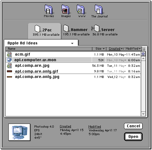
THE NEW, SPIFFY OPEN DIALOG BOX. Most noticeable is probably the server and folder icons on top* which serve as a list of shortcuts. Additional folders and volumes can be added by dragging them from the main window.
Other than that the selected file shows additional information underneath the list and as we are viewing the list by date created, the items in the list have a divider line between the days.
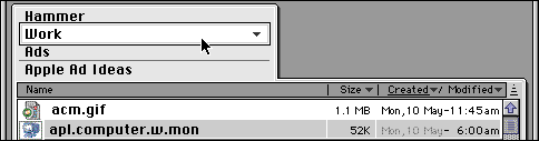
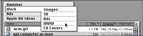
TO NAVIGATE UP THE FOLDER HIERARCHY, you simply click (not click and hold) on the current folders name and follow the list which pops up, pretty much as you can do now.
HOWEVER, YOU CAN ALSO MOVE VERTICALLY. Just click again and fly away!
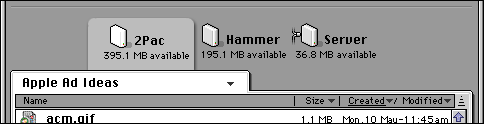
VOLUMES BECOME OBVIOUS. You can see what hard drive you are looking in simply by which one is tabbed- in the light frame connected to the main window.
Guess which volume is remote? Try the one with the standard Apple cables on its side :)
And guess what, the next piece is about making this whole business of Open/Save Dialog boxes obsolete...
*The server icons are from an online collection, author unknown, pleas e-mail us if you know who created them. The folder icons were created with the excellent Folder Icon Maker Deluxe.
©1995-2001 The Liquid Information Company www.liquidinformation.org