Better Overview & Transparency.
Icons don't do enough if they are mere pointers to documents, they need to help the user navigate by also being previews to what the icon represents.
Document Icons
They need to do this both by showing what's unique about their content (like a Photoshop preview image icon today) and what media type they are (still image, video, text etc). It's great to see a preview image icon (like the ones Adobe Photoshop produces; where the icon is a thumbnail of the image itself), but it would be very useful to see whether the document is a video or a still image for example.The ways things are today, if you have preview icon of a still image and one of a video clip, there is no way the icon will reveal which one is the still image and which one is the moving video clip.
But there is a simple solution. Frame the previews with information about what kind of the media type the document is:
HERE IS AN EXAMPLE OF A STILL IMAGE ICON. You can see that it is indeed a still image by looking at its frame, which is intended to look like a picture frame.
THIS ONE IS AN ANIMATION FILE as can be seen from its vertical sprockets and from the fact that the next frame is showing through a wee bit at the bottom.
ADDED INFORMATION can come in the form of a small icon of the creator application. Something I hear Apple looked at and called badging. Great stuff!
MOUSEOVER INFORMATION can be very useful to give yet another level of information. For animation that can be size (height and width) and length as shown here whereas for stills it can be dpi and size (height and width). This video image also shows a 3 frame preview loop. Obviously this can be too much and therefore needs to be a user cancelable option.
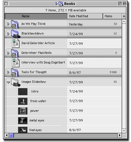
Easels Helix can even zoom into the folder and show the documents at much larger sizes, even making the text preview in text files legible.
HIGHLIGHTING is currently high-darkening in the current MacOS; the icon goes darker, which is not something you want to have happen to what you have directed your attention towards, you want it to become more prominent and more clear, revealing more than before. So frame it, frame, it frame it!
RELATIVE SIZES It is important to consider that the different media types (text,video etc.) all have their own different relative sizes. A 15MB video file can be considered small, whereas a 2MB text file might be considered huge, because of their different data structures. Keeping this in mind partly helps decide how to use the very limited icon screen real estate to show relative sizes.
With the image files here the rule is: the smallest is in Kilobytes. The medium one is in Megabytes and the biggest one in 10's of Megabytes or more.
DIFFERENT MEDIA TYPES NEED DIFFERENT KINDS OF SIZE VISUALIZATION. By that I mean that still images get bigger in two dimensions as above, and text as page upon page ie; multiple pages stacked one behind another as is illustrated here.
The first icon represents a text document of less than 3 pages (less than 1 or up to 2 pages, printed both sides of the paper), the second represents less than 20 pages (should be a user preference somewhere, the thinking is that this is about as much as paper clip will hold) and finally, anything bigger, which will need to be bound. Yes, that is supposed to be a bound/book icons :)
Different users have different ideas of what a large file is. A web designer thinks an image which is over 50K is huge (or should anyway), whereas a print designer thinks 20MB is an OK working size for even a relative small image. How do we get around this problem? There are a couple of ways which if used together could work: User can tackle this one themselves. In two ways; you should be able to tell the machine something about who they are when they buy the machine. A web designer should be working on a very different machine from the print guy etc. Also, users should be able to set relative sizes manually in a funky new control panel. The computer could also monitor relative sizes for the user (risky though). Finally, the file format could help determine what the expected sizes are. Gifs are normally small. Tiffs can be huge in comparison. Video files saved with animation compression relatively small,whereas files compressed with a proprietary video compression card/format, because it's liable to be full frame, full motion; huge.
Getting Info
In the desktop article, it is explained how, when an icon is selected, it should reveal more about itself. This is illustrated by having the text description show more information when the item is selected. Of course, icons should reveal more when selected too. It could show a couple of key frames if it's video. If it's a text document, a larger, now legible, introductory sentence could pop up. Audio could play a piece of audio preview. And so on. Additionally, the icon should indicate whether there is any comments about the document:
HERE WE HAVE A NOTE (GET INFO) ATTACHED TO A FILE. This note could have come from a PDA (see the 'PDA to Desktop Note Synching' article), or it may have been directly entered in to files 'Get Info' comment field.
Folders
*EXPLORATORY CONCEPTUAL WORK ONLY - NOT A VISUAL EXPLORATION*Folders have the potential of revealing more information of the individual documents they contain. Considering that in the real world they bulge when filled to capacity but on computers they still look the same if they contain thousands of documents or one. Or none at all.
For a folder full of documents which are pretty much the same type, it is easy to badge the folder with the kind of documents is contains and a number of documents contained:
MORE INFORMATIVE Showing you how full it is and whats inside
And the empty folder, easily distinguishable from one with documents looks thin and faded:
EMPTY IS DIFFERENT This one has gone semi-transparent and pale.When folders really do hold a mixed jumbalaya of media types, that can be a problem. Such folders could show the top three media types as shown here:
MIXED NUTS With all kinds of goodies
Alternatively the user could have quick and easy access to a utility such as Folder Icon Maker (grobbins@null.net) to create their own custom folder icons based on the content of a document. Here the document icon has been used to create the folder icon:
FOLDER ICON WITH SOURCE
MACOS X VERSION (PHOTOSHOP MOCK-UP)It is also important that folders do indeed look like folders and not a file. Today, when it's possible to give folders any icon it's sometimes impossible to tell if a file is a folder or a document. A solution like Folder Icon Maker solves this problem in the same vein as the icons do above; they allow the user to customize the icon, but it becomes framed in a folder icon.
Open folder pose other interesting issues, showing transparency the opposite way. Where is this folder in the big scheme of things? Apple currently allows you to see this by 'Command'-clicking on the folders name, a handy feature which few are aware of. It might be useful instead to place a pop-up triangle next to the title, to allow one-click access:
MOVING UP Showing where the current, open folder is in the great scheme fo things.
It's great to live in a networked world where for many intents and purposes it doesn't matter if the folder is on you local computer or even on you local office network, but it would be handy to see which folder is local, especially when copying between folders of the same name.
A simple networked computer icon in the head could do the trick of identifying the non-local folder:
NOT LOCAL - FOLDER ON THE NETWORK. Notice the standard Apple cable usually used to indicate a networked volume? Why not use it to show a network folder?
There are other issues with folders once they are open and show other folders within themselves in the list view. Are icons of folders still the best way? How about something which gives the feel more of looking into a sectioned folder with tabs, where the tabs can be pulled back to shown the content:
GETTING A BIT CLUTTERED.
EXPLORATORY WORK ONLY
ANOTHER EXPLORATIONFolders could potentially show more than media types and the amount of items they contain, but this is taken care of pretty well in the lists views already. Additional info could still be presented without cluttering the icons too much such as the yellowing of older icons as proposed in Apple's "The Art Of Human-Computer Interface Design".
Volumes are not folders